Product Quiz Conversion Rate Benchmarks (2026)
Product quiz conversion rate benchmarks are a Quiz Denominator Ladder: RevenueHunt 5.5% of completers; ConvertFlow 5.2% of viewers. Not sitewide CVR.
One-page vs multi-step checkout: Baymard says fields beat steps (avg 11.3 fields / 5.1 steps). Shopify same info both layouts; ~4s faster self-report.

TL;DR: One page vs multi step checkout is a Field Weight Ladder, not a format religion. Baymard’s 2024 ecommerce UX benchmark finds the average checkout is 5.1 steps and 11.3 form fields, while most sites need about 8 fields — and fields beat steps for usability. Shopify collects the same information on one-page and three-page layouts; its blog self-reports about 4 seconds faster completion on one-page.
Merchants Google one page vs multi step checkout hoping for a winner. Agencies sell “move to one-page.” Designers swear multi-step reduces overwhelm. Decks quote a single A/B with no field census attached.
One page vs multi step checkout matters when you are about to burn a quarter rebuilding Shopify layout while the real leak is fifteen visible inputs, a coupon trap, and a billing address twin. This page sits next to checkout conversion rate benchmarks, guest checkout vs forced account creation, cart abandonment rate reasons and fixes, and express checkout conversion rate benchmarks.
One page vs multi step checkout is the choice between putting contact, shipping, and payment on one scrollable surface versus spreading those jobs across sequential pages (or accordion steps).
It is not a different data contract on Shopify. Help docs say both layouts ask for the same inputs and expose the same checkout analytics (Shopify Help). The fight operators actually mean is perceived effort: how many fields stare back, how many times the page reloads, and whether progress feels finite.
Baymard’s older one-page essay already warned that A/B “wins” for one-page often compare an optimized single page to a bloated multi-step control. Hold field count equal and split the same inputs across two pages, and completion tends to look similar (Baymard). That 2011 thesis still pairs with the 2024 field census: format is packaging; fields are work.
This article owns the Field Weight Ladder. Clock-start completion meters live in checkout conversion rate benchmarks. Account walls live in guest checkout vs forced account creation.
Wrong layout bets rebuild the wrong surface. You ship a one-page theme and keep 11+ fields, a default coupon box, and dual addresses — then blame “mobile shoppers.”
One page vs multi step checkout works when you score field weight first, treat step count as a soft proxy, use layout as a forcing function to cut inputs, and only then read platform speed claims or single-store anecdotes. Equal fields on one page versus two pages rarely invent a conversion miracle.
| Rung | What you measure | Labeled public anchor | Decision |
|---|---|---|---|
| 1. Visible fields | Required + default-visible inputs | Baymard avg 11.3 (2024); target ~8 | Cut or hide before you rebuild layout |
| 2. Steps | Distinct phases cart → review | Baymard avg 5.1; soft pain after 8+ | Cap sprawl; do not fetishize “one” |
| 3. Layout | One-page vs multi / three-page | Shopify: same information both ways | Pick packaging after field audit |
| 4. Speed / platform | Completion time or vendor claims | Shopify blog: ~4s faster on one-page | Label as self-report, not industry CVR |
| 5. Anecdotes | Single-store before/after | CandyRack 54%→57% (n=1, not A/B) | Hypothesis only |
Sources: Baymard form fields; Baymard one-page; Shopify Help; Shopify blog; r/CandyRack.
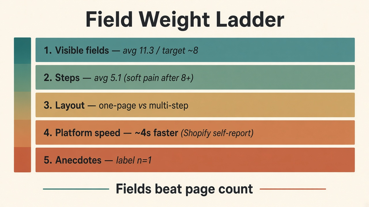
Source: Baymard, 2024; Shopify Help / blog, 2023–2026. https://baymard.com/blog/checkout-flow-average-form-fields; https://www.shopify.com/blog/one-page-checkout.
Baymard’s research lead states the step-count question is a red herring: as form fields rise, checkout UX performance falls, and field count impacts usability more than step count (Baymard). A one-page checkout with 30 fields will feel worse than a three-step flow with tight forms — the same caution Shopify merchants hear paraphrased in abandonment guides.
The practical backlog is boring and high leverage: one full-name field (89% of benchmark sites still split name), hide Address Line 2 (75% don’t), collapse coupon codes (35% show them by default), default billing = shipping with fields hidden (24% still show both), delay account creation (84% fail) (Baymard). That last item overlaps the Guest Prominence Stack on guest checkout.
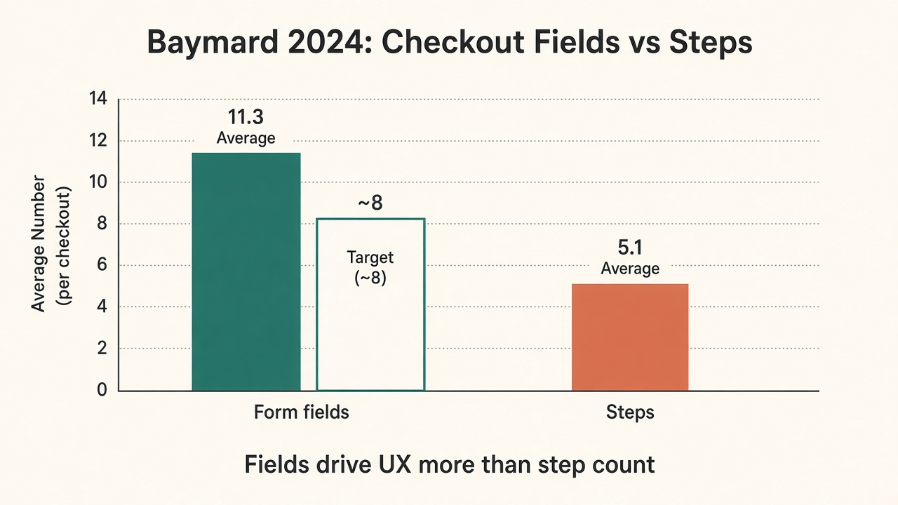
Source: Baymard, June 26, 2024. https://baymard.com/blog/checkout-flow-average-form-fields.
One-page helps when it forces the field cuts you were avoiding, reduces page-load churn, and collapses pre-filled sections for known buyers — the Shop Pay–inspired pattern Shopify describes (Shopify). It does not help when you paste a heavy multi-step form onto one scroll and call it modern.
Multi-step still fits complex fulfillment, high AOV, or B2B flows where progress indicators calm risk — as long as each step stays light. Baymard’s Holst piece is blunt: users rarely fail at “next page”; they fail at what each page asks them to do (Baymard).
Help Center facts: same customer information, same analytics, same customization surface, switchable layouts, one-page default on many plans (Shopify Help). Marketing claims: about 4 seconds faster average completion; platform checkout improvements since early 2022 said to add up to 1.5% conversion lift — a broader platform story, not a pure format A/B (Shopify). Cite both. Attribute carefully.
Community anecdotes stay labeled. CandyRack’s public write-up of one low-AOV Shopify store saw checkout conversion move from 54% to 57% after one-page, with ~80% mobile traffic, and the authors note it was not a proper A/B (r/CandyRack). Useful as a hypothesis for similar catalogs. Useless as an industry law.
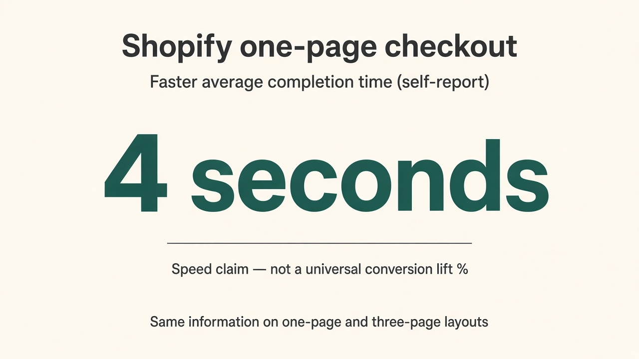
Source: Shopify blog, September 25, 2023. https://www.shopify.com/blog/one-page-checkout.
Checkout conversion benchmarks own Littledata’s 45% checkout-started completion and Baymard’s 70.22% cart abandonment clocks. This page owns format versus field weight. Express checkout wallets skip typing; they do not excuse a bloated residual form for guests who land on card entry.
Run this sequence before you hire another theme shop. Each step is at most two sentences.
Q: Is one page vs multi step checkout better for conversion? A: Neither format wins by default. Baymard finds field count drives usability more than step count, with 2024 averages of 11.3 fields and 5.1 steps and a practical target near 8 fields. Use layout to force field cuts, then measure your own checkout-started completion.
Q: What does Shopify say about one-page vs three-page checkout? A: Shopify Help states both layouts collect the same information, share analytics, and can be switched in admin, with one-page as the default on many plans. Shopify’s blog separately self-reports about 4 seconds faster average completion on one-page.
Q: How many form fields should checkout have? A: Baymard’s 2024 benchmark averages 11.3 fields and argues most sites need only about 8. Start by hiding Address Line 2, collapsing coupons, defaulting billing to shipping, using one name field, and delaying account creation.
Q: Did one-page checkout close the mobile conversion gap? A: Not by itself. Mobile still carries most of the session weight on many stores, and field typing friction is worse on phones. Pair layout choice with field cuts, wallets, and the device ladder on mobile vs desktop conversion rate gap.
Q: Can I quote a universal one-page conversion lift percentage? A: No. There is no public dataset that cleanly pools one-page vs multi-step A/Bs across ecommerce into one lift law. Single-store moves like CandyRack’s 54%→57% stay labeled anecdotes, not industry medians.
One page vs multi step checkout rewards merchants who audit effort before aesthetics. Baymard’s 2024 census says the average flow still asks for about 11.3 fields across roughly 5.1 steps, while most checkouts only need about 8 fields — and fields beat page count for usability. Shopify’s layout switcher changes packaging, not the information contract; speed claims and one-store anecdotes are inputs, not scripture.
If you want distribution that already converts attention into affiliate-sold storefronts, list on feat..
Product quiz conversion rate benchmarks are a Quiz Denominator Ladder: RevenueHunt 5.5% of completers; ConvertFlow 5.2% of viewers. Not sitewide CVR.
Size guide conversion rate impact is a Size Confidence Ladder: Baymard 83%/87% fail sufficiency; Snipes Fit Finder +3% all-traffic vs a static chart.
Sticky add to cart conversion lift: Vitals 9.3% of orders involve the bar; Growth Rock +7.9% desktop vs scroll-to-section with no order lift.